Hello all! And a happy new year. 2016, eh – it’s kind of crept up on me this one! And unfortunately, it’s brought with it (for me) a nasty cold, so I’m typing this feeling rather under the weather today. Forgive me if this post is on the short side!
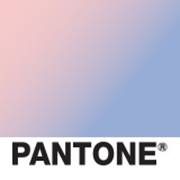
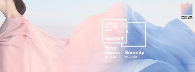
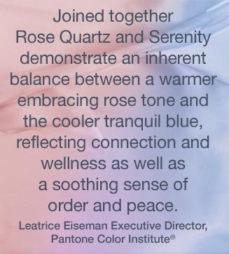
This month, I’ve decided to feature the new Pantone’s Colours of the year. Yes, you read that right – colourS! They’ve decided to go for two shades this year, kind of merging them together in an ombre effect, instead of the usual one, strong hue. Meet Rose Quartz and Serenity.
Let me be the first to say that I am NOT overly convinced by this combination. I do like occasional pastels, but baby blue and baby pink….together?! Not doing it for me yet. And I know I’m not alone from the comments online.
 |
| Meh… |
HOWEVER, what I love about exploring colours is the unexpected things that you find, and how colours you thought you hated can really set you alight when you see them in an alternative palette/context. So this month is going to be about exploring these colours – together and separately – and seeing how bead artists can convince us that these are THE colours for 2016!
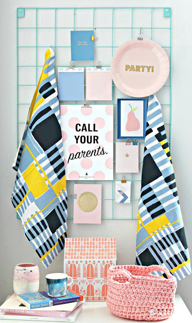
I’ve got to say, seeing this little scene from Little Big Bell, the official announcer (I believe!) of the new colours of the year, has got me thinking just a little. I have a feeling that the key to these colours not being too wishy washy may well be the addition of black….watch this space. But I’m also interested to see that both in the above scene, AND in last month’s challenge piece…
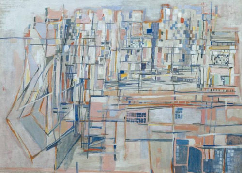
…there are pops of yellow that really add a touch of something solid and definite to the delicate pastel tones. As always with colour, it’s going to be HOW you use these colours that really makes or breaks them.
So what do you all think? I’m interested to hear your thoughts. I’ll start sharing beads I’ve found in these colours from next week – if you spot any, please leave links below!
And now for the BeadBlogger Links. Have a great week everyone!
Rebecca is a Scottish jewellery designer; currently living in the capital city of Edinburgh. You can read more about her and her work at her blog, songbeads.blogspot.com and see more of her jewellery at songbead.etsy.com. She also has a supplies shop at thecuriousbeadshop.etsy.com.

Maneki
January 4, 2016 at 11:04 pmNot much of a pastel fan so this didn't wow me, but on a positive note: when you mix the colours it creates my favoruite colour, purple! Albeit not my favourite hue of purple. So I've been thinking of playing with, e.g. with layers of organza (or organza over bead or other component), transparent pink seed beads with blue thread or colour-lined beads (drops and triangles are especially fun in lined or maybe lampwork beads with layered colours).
My usual strategy when having to work with pastels is often to mix it with a dark colour, such as navy. Or in this case perhaps indigo and a darker pink like indian pink. Or add a light and a darker purple. But to challenge myself, I think I'll try to work with pastels or at least dusty pastels. Adding some white/ivory to keep it really light and cute. Flowers and sunrises of cause being my first go-to inspirations.
Using them seperately, Eva Maria Keiser has some nice tips on her blog.
The two colours are a tad toned down, they've added a little dust to the hues, but of cause I'd personally prefer them even more dusky. Lite in this inspiration board: https://www.pinterest.com/pin/3237030959495290/ (and, for pink, this one: https://www.pinterest.com/pin/554576141586696561/ )
Terri
January 4, 2016 at 11:38 pmWhere I'm not one to where pink …the blush pink looks nice with my coloring. Admittedly wearing blue is much easier for me. Maybe you all would agree with me….There is cute and there is sophisticated cute. So I see this as not cute baby pink and blues but a sophisticated version of those colors. And I really like that shade of violet where the two over lap. Will have to dig in the ol stash and see if there is something I can use for this challenge.
Ann Schroeder
January 5, 2016 at 2:30 amLooking at the Pantone picture of the colors, at first it doesn't look like much. But I am really excited about the colors of the year. My favorite color as a child was pink, but as I became an adult, I gave that up. However, I finally "came out" to myself last year as someone who really does love pastels (after I kept buying pastel beads). You can use them in so many ways – it doesn't have to look like kid stuff! I'm excited to try working with these colors and your posts this month will be helpful and great fun! I hope you feel better soon.
Katherine Thompson
January 5, 2016 at 1:33 pmI thought that the December challenge was a great representation of the 2016 color board! Terri and I were having fun the other night looking at the varying shades of blush, well her more than me she got to shop! None the less I even like the color puce!
gloria allen
January 5, 2016 at 4:01 pmLuv, love this combination. I love pink, my favorite color decorating home is blues. I up for the challenge, lol.
Terri
January 5, 2016 at 4:15 pmHa ….that is what I get for not really reading …but scheming. Had a migraine so I wasn't really reading …but Boy don't I feel like Homer Simpson…Duh! Lol…clearly not the ABS monthly challenge. Sorry you are under the weather…hopefully this cold will be it for you for the year!
Terri
January 5, 2016 at 8:21 pmnot scheming..rrr …scanning what's wrong with that automatic spell check…I already Know I can't spell..if it wasn't laughable I'd cry…