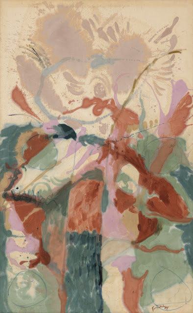
This month’s amazing inspiration is from one of my favorite artists, Helen Frankenthaler. I fell in love with her abstract expressionist paintings and sophisticated use of color when I was in art school. This painting just makes me swoon.
I could make jewelry for days with this color palette. Love the pops of color in terracotta and orchid mixed with those succulent greens and balanced by those neutral hues.
I could see you mixing in colors with leather, waxed linen, sari silk or color patina on chain. Get creative with how you use color in this month’s challenge.
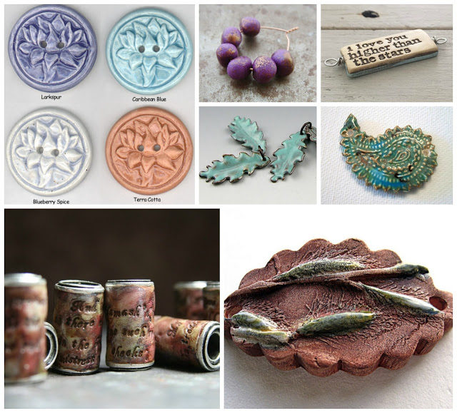
I checked out the Art Bead Scene editor’s shops for a few picks that would work perfect for this month’s challenge.
Top: 1. Creative Impressions in Clay
(Don’t forget Tari can make any of her buttons into pendants for you!)
2. Humblebeads. 3. Swoondimples.
Middle: Gardanne Beads. Firefly Design Studio.
Bottom: Tesori Trovati. Mary Harding.
So what colors are you loving from this month’s painting?
Do you find the abstract paintings more freeing or more of a challenge to interpret?


Katherine Thompson
April 7, 2016 at 1:30 pmI'm with you on the colors, they are very creamy to me. I love the softness and because she saturates her canvas the colors come off as dyed silk.
I keep pulling out the pink, cream and green.
I love abstract because it's like looking at clouds, I see all kinds of shapes. My goal is not to just pick a color but to represent the mood of the painting through my personality. I really try to always represent the painting.