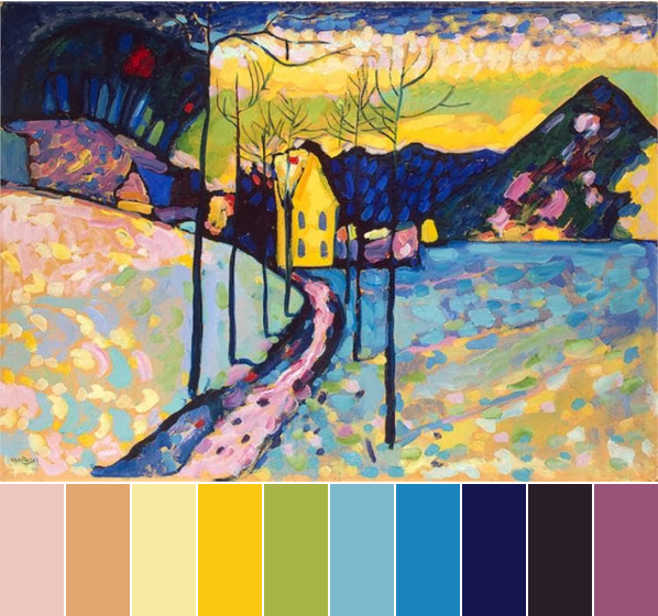
This month, we have the lovely Winter Landscape by Kandinsky as our monthly challenge inspiration. Winter Landscape is a fun painting to use, because it has colors in it that people wouldn’t normally associate with December or winter. Instead of reds and greens, or only cool shades of blue, we have a mix of soft pastels and bold hues.
The two boldest hues are the bright yellow house and sky and the deep saturated blue of the mountains and trees. If you’re looking for a focal color for your design this month, choose one or both these, and keep them nice and bright and saturated to follow the inspiration painting.
The soft pastels are a mix of springtime colors: light pinks, pale yellows, a peachy tan color, light green, and baby blues. They make for an interesting juxtaposition against the bold yellow and blue, and because they are lighter, less saturated colors, they’d work well as support colors. There’s no harm in bringing as many of these in as you would like, since Winter Landscape uses them frequently, and all over the painting. Out of all of these softer colors, my eye keeps getting drawn to the pinks, as it creates a triad color scheme with the yellow and blue, but any combination you choose would work here.
There are also dashes of other colors, too. Purple, in both a lighter shade and a darker one, and a few touches of red. If you’re looking to challenge yourself this month, work on bringing small touches of these in, too.
Your turn: what colors are you loving from this month’s challenge painting?


Anna
December 5, 2013 at 3:40 pmLove this vividly colored piece by Kandinsky – no fear of color usage here! I'm especially drawn to the play of warm and cool colors. They set up such wonderful color vibration, which is especially apparent in the foreground areas of this painting. I've been trying to incorporate this Impressionist concept into a piece I'm making for the Bead Dreams competition.
Thanks Brandi, Heather, and all the ABS gang for the beady inspiration!
Susanm
December 5, 2013 at 5:16 pmThe first thing I noticed when I saw this painting were the pinks! One of my favourite colours and I think I have the perfect focal bead in my stash. The painting is so vibrant, yet conveys a strong sense of the season.
autumndawns
December 6, 2013 at 2:23 amWow! I really like this choice for a December inspiration. Can't wait to see the beautiful jewelry Kadinsky's Winter Landscape inspires. My favorite color is the yellow, so vibrant.
Irit M
December 6, 2013 at 11:26 pmLove the combination of those colours.
I would like to make some bead jewelry with those colours.
I just remembered that I bought in England a long blouse at dark blue like in this painting and it came with a lovely pearls collar. It was a perfect match. What was amazing that the collar of beads was not attached to the blouse. So I can use it on a different blouse.
I tried to find panes/tites in a pearl colour, but couldn't find. I bought in light blue, but it does not match, especially with this pearl collar. I think of sewing by myself a pair of panes or tites. I will see…..
I am looking forward seeing you jewelry piece from that colours!!
Jean
December 8, 2013 at 4:32 pmLovely selection to prompt inspiration and also just to look at!
jean yates