Every month, Etsy’s blog puts out a list of the upcoming trends that they are seeing (or are looking for) in merchandising, things like magic and owls, letters and symbols, feathers and lace, or personalization and found objects. I have not really delved into staying too much ahead of the curve when it comes to hot trends with my new ‘simple truths’ components, but it would probably be a good idea if I would like to continue with them!
One of the things on their list is following the latest Pantone color trend report. According to Pantone, this fall they are inspired by “The Art of Color,” so what better thing to be inspired by than art beads that follow those trends! I love to shop on Etsy so I thought that I would take their latest trend topic and see what I could find that would interpret these colors in art beads specifically.
Of these colors, Pantone says this: “Taking cues from the great masters, sepia tones of Old Hollywood, Chinese opera, cityscapes and countryside, designers are paying close attention to texture, contrast and color for fall 2011.” I couldn’t agree more! And this palette is considered “Sensible and Spirited.”
A little about the new fall colors:
And here is my Etsy Treasury, filled with my tried and true favorites for art beads, plus the added bonus of new-to-me bead artists (I feel a need to go on an Etsy binge!):
‘Pantone Fall Art Bead Trends’ by TesoriTrovati
This Treasury shows off Art Beads that fit the Pantone fall color trends! Thanks to those artists who make their own art beads, we will never run out of options for our unique creations!
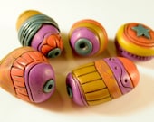 Circus Petals in Khaki Teal … Circus Petals in Khaki Teal …
$24.50
|
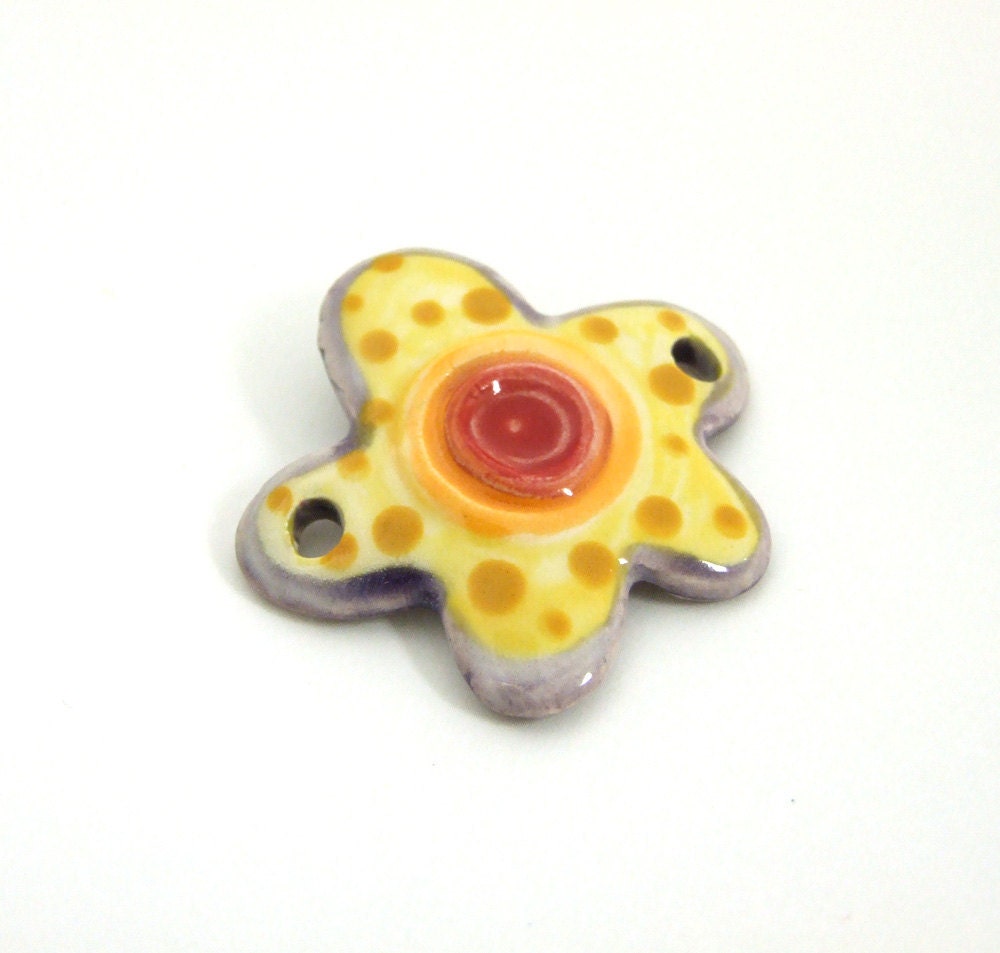 Jangles Ceramic Flower Link Jangles Ceramic Flower Link
$10.00
|
 Bead Caps, Torch-Fired Ename… Bead Caps, Torch-Fired Ename…
$4.00
|
 Cedar Green, Black & Ivory S… Cedar Green, Black & Ivory S…
$4.50
|
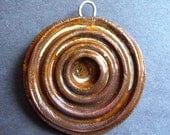 Large Funky Ceramic Bead pen… Large Funky Ceramic Bead pen…
$10.00
|
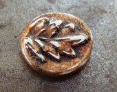 Tiny Oak Leaf Charm Tiny Oak Leaf Charm
$8.00
|
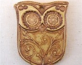 Adorable Earthy Brown Owl Pe… Adorable Earthy Brown Owl Pe…
$14.00
|
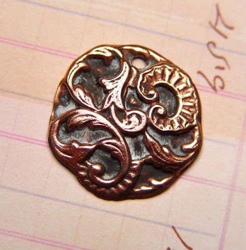 Quatrain Circle Pewter Conne… Quatrain Circle Pewter Conne…
$15.50
|
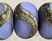 Handmade Amethyst Frosted Gl… Handmade Amethyst Frosted Gl…
$14.90
|
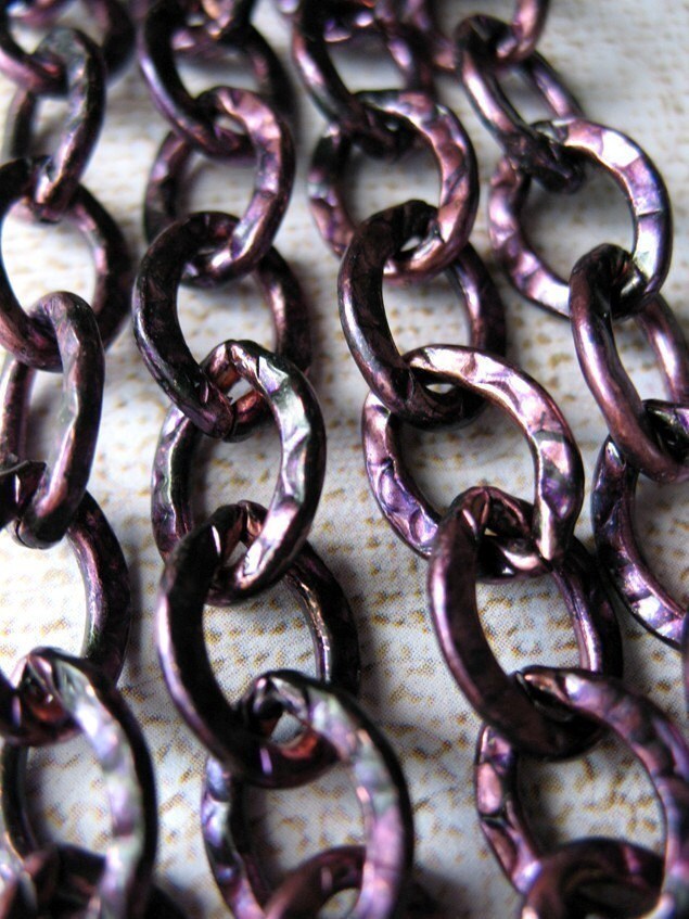 Violet – Large Textured Copp… Violet – Large Textured Copp…
$9.00
|
 be thank full – simple truth… be thank full – simple truth…
$30.00
|
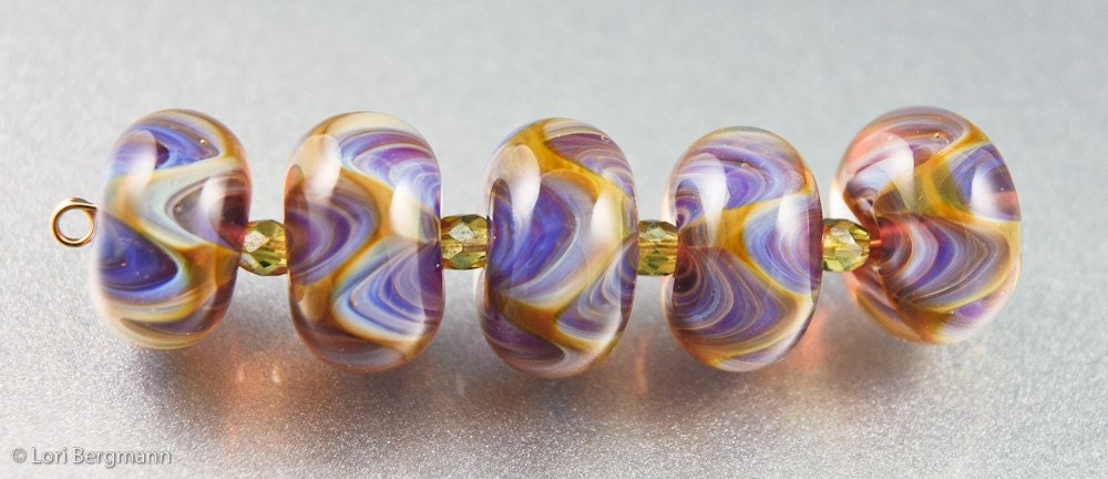 Wisteria Waves – Handmade La… Wisteria Waves – Handmade La…
$33.00
|
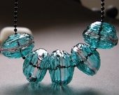 Handmade Hollow Lampwork Bea… Handmade Hollow Lampwork Bea…
$20.00
|
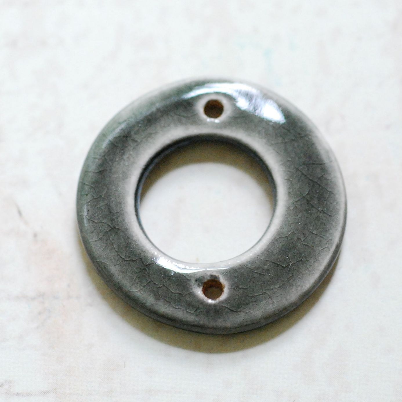 Ceramic Bead Donut Pendant T… Ceramic Bead Donut Pendant T…
$10.00
|
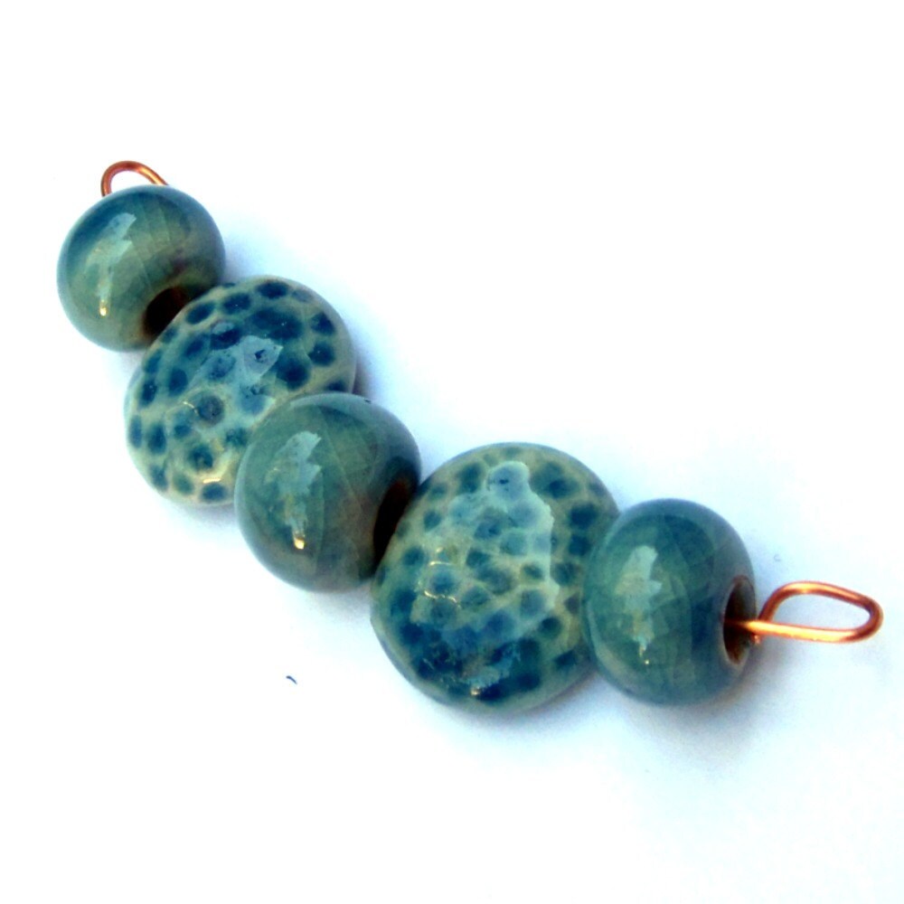 Porcelain Beads Teal Blue Le… Porcelain Beads Teal Blue Le…
$10.00
|
 3 Handmade Porcelain Light t… 3 Handmade Porcelain Light t…
$7.50
|


SummersStudio
September 13, 2011 at 11:33 amI love looking at the Pantone palettes but don't really incorporate them into my work. For one thing, in ceramics it can take months to change up a glaze palette. So it's not really practical. But I think your idea of labelling for Etsy listings is excellent!
T...
September 13, 2011 at 11:46 amMy favourite is the teal/nougat and bamboo/coffee liqueur combos.
I came across these new colours while shopping one day and came home to look them up, making feel the need to bead….so posted about them on my blog as well 🙂
glad to see I'm hip to the trend 🙂
Shirley
September 13, 2011 at 11:59 amErin, I love reading about the Pantone color reports, thank you for the update. I think these are a very unusual take for what most people think of as "fall", but they are truly beautiful. Each year as I look for a few pieces to add to my wardrobe, certain colors emerge as my "color" for that season. So, I don't follow the popular trends, just my own! 🙂 The good thing about having a somewhat neutral clothing palette is that it is easy to use these wonderful colors in jewelry, and not clash. So, I'm excited by the new show of colors. Yeah, a reason to shop!
Alice
September 13, 2011 at 12:04 pmWhat a beautiful treasury!
I've never been one to follow the trends in either my jewelry creations or my own wardrobe. I dislike waste and can't stand seeing clothes or jewelry sitting around or even discarded because it is no longer in fashion. I tend to stick with the classics that will always be around.
Catherine
September 13, 2011 at 12:11 pmI think adding these colors in your shop can be a good tool for getting treasury spots and maybe noticed by Etsy, but I'm not convinced that your average shopper is following (or even knows of) the Pantone forecast. It's more likely that they either have favorite jewelry colors that they browse or an outfit they need to coordinate with (which might be influenced by Pantone).
I like the blues (deep teal & quarry), but am not feeling honeysuckle as part of a fall lineup.
I LOVE color!
September 13, 2011 at 1:36 pmGreat post as it happens my creation for the BSBP are the top colors on the pallette. and the varigated browns. Ae you speaking of Johannas Itten's The art of Color. I know it well. I teach from his color star.
Be Blessed to be ablessing. Sandy
Karen Totten
September 13, 2011 at 1:47 pmI'm really liking this new palette. My current fav combinations:
bamboo / phlox / emberglow
plhox / cedar / orchid hush
quarry / bamboo / deep teal
bamboo / phlox / honeysuckle
cedar / coffee liqueur / quarry
deep teal / bamboo / quarry
And yes, speaking from my past experience as an architectural designer, industry pays attention to these forecasts – it helps manufacturers of fabric, paint, carpeting, etc., to focus on common palette "themes" as they re-tool for each new season. That way, if I need to specify carpeting for a project, I can be reasonably assured I will find coordinating materials (upholstery, wallpaper, etc.). I imagine the same is true for fashion: coordinating fabrics, accessories, shoes, etc. I don't mean "matchy-matchy" – just enough to know that there are available harmonies to choose from.
Any anyway, it's just plain fun – nice for inspiration!
ShinyAdornments
September 13, 2011 at 4:11 pmGood questions!
What is your favorite Pantone fall color? I'd have to say Cedar…but I don't think its the best color for jewelry. A nice cashmere sweater, maybe. 🙂
What is your least favorite Pantone fall color? Definitely orchid blush
What is the most surprising Pantone fall color in this palette? Quarry. Not the color, exactly, more the name. It doesn’t connote that cool blue I see.
Will you create jewelry following the trend of these colors or just stick to your favorites? Boy, good question. Each year when Pantone publishes their palette, I try to choose stones that adhere to at least a few of the chosen colors. I’m sure I’ll try to do the same this year.
Kristy
Shinyadornments Handmade Jewelry
Simply Shiny Blog
BackstoryBeads
September 13, 2011 at 4:13 pmCedar is my favorite from the current color report, and I love the way it's showcased in your treasury with black and cream. I'm currently pairing it with deep, dark reds, which will be terrific for Fall. I'm also working on a choker in Deep Teal with browns and orchids. So, yes, I definitely design with the current colors in mind.
Patternsforbeads
September 13, 2011 at 6:01 pmI like the Pantone for fall colors. BUt I always am a sucker for the many shades and hues. It is nice to see some purples for fall, that's fun. YOu can mix so many colors with purple it is almost like a neutral. I will love to see some projects like that. The reason I started beading, I saw a person make a hollow bead. I was mezmorised all those years back. I not only began beading, but eventually learned to make glass beads and finally a hollow one or two. The Nadin Glassico hollow beads made me nostalgic!
Kristen
September 14, 2011 at 11:15 amQuarry is a gorgeous color. I think I will see if I can find some of these colors in glass enamels. It's hard to predict what will come out of the kiln. The torch enameled bead by Paintingwith fire is perfect though!
Triche
September 14, 2011 at 3:15 pmFavorite? Phlox, hands down. Least favorite? Bamboo. It reminds me too much of the old Harvest Gold. (Ick—I still remember that shag carpeting! It's like a nasty taste in one's mouth.)
However, since making jewelry is my way of relaxing from my job, I don't bother with trends. Instead, it's a way to use my hands and love of making to explore forms and colors that fascinate me. And if other people happen to like them, too, that's great.
Lori Bergmann
September 14, 2011 at 7:19 pmThank you so much for including me in this gorgeous treasury! I love this new color palette and have been inspired to create some new color combinations! My favorite Pantone fall color here is a tie between Honeysuckle and Phlox.
My least favorite of the colors would have to be Emberglow (I'm just not that into oranges).
I think the most surprising Pantone fall color in this palette would have to be Orchid, as I would have thought that was a spring color.
I am definitely planning on creating both glass beads and finished jewelry using these trends since they also happen to be some of my fave colors! *Ü*
maneki
September 18, 2011 at 1:12 pmI enjoy the Pantone colour reports, not for keeping up with trends or adjust anything I do, but to find new colour inspiration. For example, this season, the honeysuckle (and also emberglow) has made me think more about pink in combination with more traditional autumn colours. I can use it as inspiration, but also to challenge myself to try new shades or colour combos.