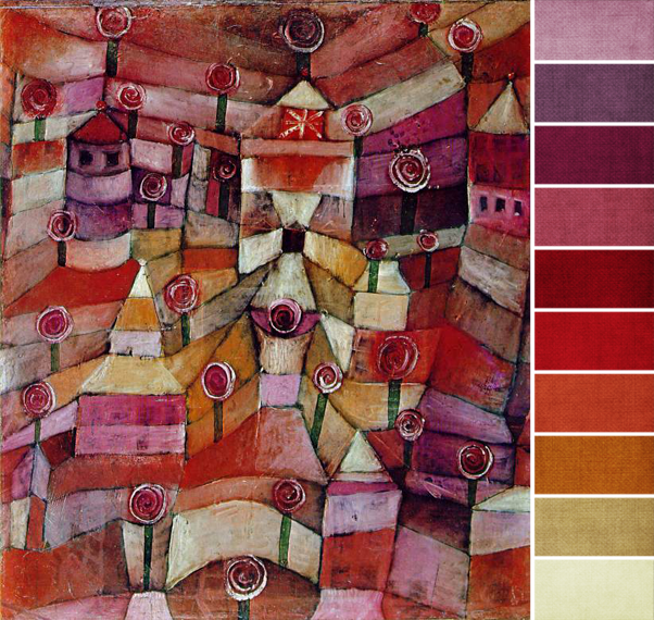
This month’s artwork is all about reds and purples and every shade in between. Rich ruby, brick red, lavender, wisteria purple, rich royal purples, cool blue-purples, magenta pinks – pretty much any shade of red and purple are represented here, from lightest values to darkest darks, so go crazy. Bring in as many of them as you can.
To add more depth, also bring in a few shades of red-orange, a touch of brown, some warm ocher yellows, and light gray beige. All of these can also be found in this month’s challenge piece, but use these shades a little more sparingly; they’re there, but aren’t used in huge amounts.
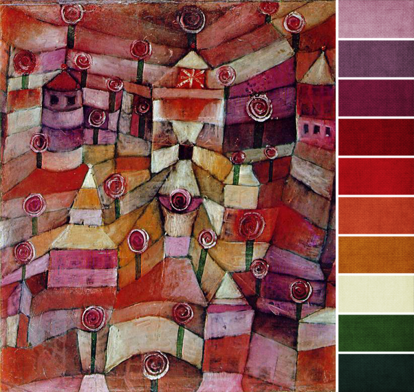
Same goes for the touches of green I see in the vertical stripes, the abstract stems maybe. I see two shades in particular: a grassy green and more of a teal green. If you do use these, follow the artwork and use only very small touches of them. Keep the majority of your colors as either red or purple. Here’s a second palette to help you see those greens:
Your turn: what’s your favorite shade of red or purple?


