Each week one of our contributors gives you a sneak peek into their studio, creative process or inspirations. We ask a related question of our readers and hope you’ll leave comments! As an incentive, we offer a prize each week to encourage you to use that keyboard and tell us what you think. The following week a winner is chosen at random from all eligible entries. Here are the results from last week!
This week is my turn in the studio & I am stoked about it! I have been having a HOOT creating little wee polymer clay owls. A BIG thanks to
Rebecca &
Heather for encouraging everyone to create with the
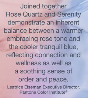
Pantone colors of the year, Serenity and Rose Quartz. Granted, I was a little disenchanted at first because these hues remind me of nursery decor and candy coated almonds. I do not like candy coated almonds, which speaks volumes because I will eat pretty much anything. I love food, especially sweets. However, once I read the reasoning behind why these colors were chosen, my heart was swayed. I can totally embrace Serenity & Rose Quartz.
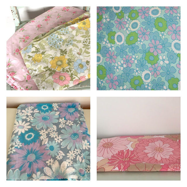
Plus, the colors remind me of the most brilliant bed linens my parents had when I was little. In the late 60’s, cheerful florals were a huge trend and hues of Rose Quartz and Serenity blue were abundant!
Now that I was in a nostaligic mindset, I began to reminisce of all the things I loved about growing up in the 70’s. Pyrex dishes, macrame plant holders, and owl everything! I am pretty certain that my affinity for owls & birds is imprinted in my DNA via my mom.
My inspiration for creating with the new Pantone colors was settled and I started experimenting with forming owl beads and pendants. My first batch was strictly Rose Quartz & Serenity and I was surprised at how complimentary the colors were together. They each exude unique & plumpy little personalities.
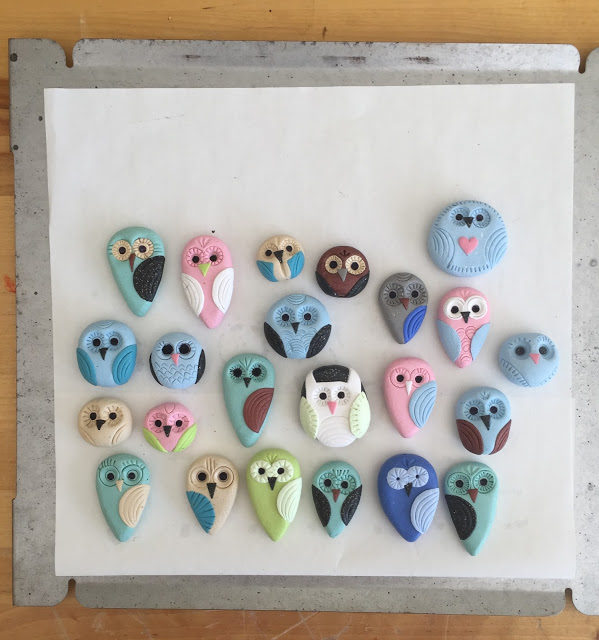
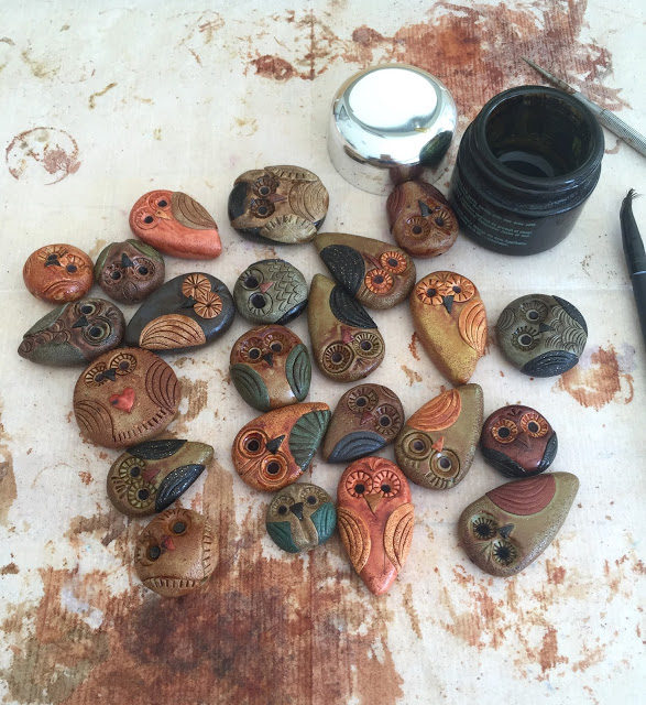
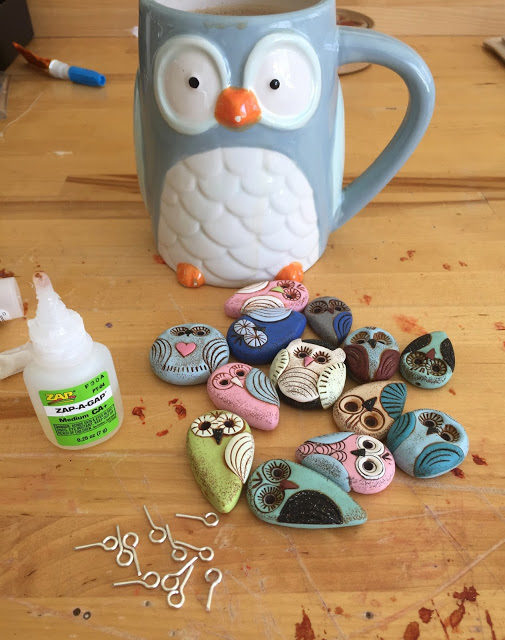
By the second batch, I was using an array of colors, combining minty hues with earth tones. (Funny, how truly naked they look before the patina transforms them)
Step 1 | Create & bake a large family of owls
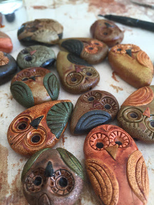
Step 2 | Slather each owl with patina
I love this step as they remind me of petrified wood and I adore the deep earthy tones
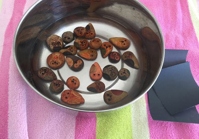
Step 3 | Give owls a nice warm bath and gently exfoliate them
(It’s spa day)
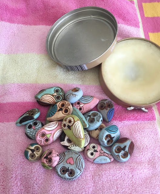
Step 4 | Massage each owl with shoe polish
Step 5 | Coffee time & glue Bails inside owls that will be used as pendants
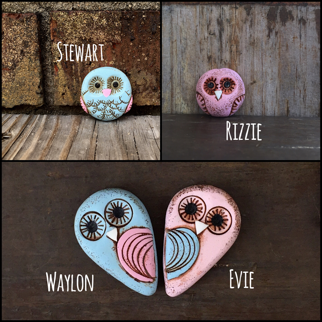
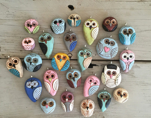
Final Step | Tada! Give each little plump cutie a name
There you have it. Inside my studio this week – where owl production is in full effect!
Hip Hip HooHoo Ray! Please swing by
my shop and meet the whole family.
This week, I’m offering a $25 gift certificate to a lucky winner.
Simply answer my question and comment below in order to be eligible to win.
“If you chose the Pantone color of the year, what would you choose and why?”
Good luck!
Heather Millican – Heather is an artist who strives to offer hope to those who may need encouragement. She is a lover of words and has a grand heart for the ones who feel too deeply, the brave, and those that find beauty in the mundane. Heather is a Savannah College of Art graduate and currently lives in Florida with her husband, 4 young boys, and boston terrier, Ollie.

Cory Tompkins
January 22, 2016 at 12:53 pmThose sheets! I seriously have the flat sheet to a set my MIL passed down years ago that looks EXACTLY like those and I love it!! I would choose a periwinkle, a mint green and a raspberry… Oh and teal, of course!!! Your owls are precious Heather, what do you use to patina them?
Kathy Lindemer
January 22, 2016 at 1:06 pmI love Serenity. Blue is such a peaceful color. It is also a color found in nature. I love to see white clouds in a sky of Serenity.
By the way your owls are very cute!
Katherine Thompson
January 22, 2016 at 1:30 pmMy pink would be raspberry simply because that's a color I look good in
Claire Lockwood
January 22, 2016 at 1:40 pmSooooo sweet! That trick with the bath is obviously one of the many polymer methods I never picked up!
freshbakeddesigns
January 22, 2016 at 3:07 pmLove your extended owl family! Thanks for the peek inside their creation. As for the Pantone color…I gotta go with blue every time. Great post, Heather!
freshbakeddesigns
January 22, 2016 at 3:07 pmLove your extended owl family! Thanks for the peek inside their creation. As for the Pantone color…I gotta go with blue every time. Great post, Heather!
Rebecca
January 22, 2016 at 3:22 pmAbsolutely gorgeous – you know I adore your wee owls! Out of the Pantone palette, I was really hoping for stormy blue. I'm not quite sure why – it's a great colour, but not my favourite….I think I felt it was/is something different, and would throw up some cool palettes. I totally had some hand-me-down bedding in those prints too!
Sarajo Wentling
January 22, 2016 at 6:34 pmWhat sweet little hooties! That limey green one is my favorite! Of the Spring Pantone colors, my favorites for color of the year would be either Limpet Shell or Green Flash. I'm still not on board with this pink & blue thing. 🙂
Mary @ MaryMorrisJewelry.etsy.com
January 22, 2016 at 7:56 pmI love the owls. It is amazing the difference the patina makes. If I chose a color it would be an aqua blue. I love the serenity of the ocean and aqua blue takes me there.
Elizabeth
January 23, 2016 at 2:12 amSimply I would choose a medium turquoise because it always brings me joy.
Here Bead Dragons
January 23, 2016 at 5:57 amPantone has so many lovely colors it's hard to pick from. But my favorites are dark greens and purples.
~cryssT
Mary Harding
January 23, 2016 at 8:34 amGreat Tutorial and inside look Heather!! Love the way the owls have evolved–especially after the patina and the bath!!
My choice of a color would be turquoise. It reminds me of the desert, Arizona and tropical waters.
Kristen
January 23, 2016 at 11:45 amI love blue in any shade! And your owls are very cheerful but wise.
Alice
January 23, 2016 at 4:01 pmWhat cute olws.my favorite pantone isLimpet Shel it remnds me of the ocean.
Heather Wynn Millican
January 23, 2016 at 4:45 pmThank you, Ladies 🙂
I like to use Adirondack alcohol inks, Cory.
Lynn
January 23, 2016 at 7:58 pmOooo, I love these owls!!! So cute! I love how the patina turned out. Must have been scary to cover all those beautiful colors with the patina. I have to go with Serenity blue. I'm not much of a pink person, though as a jeweler, I'm glad to see rose quartz get some attention. These colors remind me of the early 1990's when I got married, dusty rose and country blue were HOT! I still have a patio furniture set & knick knacks (mostly packed away) that incorporate these colors. Maybe I'll be able to get them back out…
Terri
January 23, 2016 at 11:43 pmHi Heather …I'm enamored with the style of your owls..and the varity is fantastic. Going back to the Picture of the sheets….the lower left look really familiar to me. I think I had those. Lol. So my Pantone pick is the Rose Quartz …my hubby just bought a coat for me in that color with a faux fur collar….I feel to pretty in it…so I guess that is why I like the Rose Quartz …it feels pretty and feminine.
Erin S
January 24, 2016 at 10:58 pmPantone's colors are totally uninspiring this year. Blech. If I could choose, the color of the year would be BLACK.
Alison Herrington
January 27, 2016 at 12:38 amLove your owls… already ordered a few! I went to Pantone to check out some color names and today's color of the day is Dusky Orchid. I love it! That's what I'd pick. I can make purple shades go with anything!