Happy New Year, ABS readers!
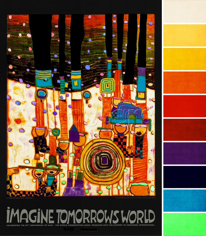
This month, we’re working with this lively piece from Hundertwasser. I love bright colors all of the time, but probably never more than during winter when the weather’s cold and nature’s colors are muted. And this month, we’ve got as bright a color palette as we’ve ever had.
Pretty much all the colors of the rainbow are represented here in fully saturated hues, even touches of colors that I haven’t included a swatch for, like olive green or pink. I look at this inspiration piece as anything goes, but if want to follow the color proportions faithfully, use a lot of orange – yellow orange, true orange, red-orange. Orange dominates the bottom two thirds of the poster with lines and shading, and the top third with shades of dark brown.
You might also want to use a lot of the aqua (second swatch from the bottom); that color is featured prominently, too, in solid squares and lines. And depending on how you choose to look at the poster, you could also include the dark gray/black of the background, too, either through beads or metal (like oxidized sterling silver). The dark gray helps all of the other colors seem that much brighter.
What colors are you feeling from this month’s challenge palette?


Katherine Thompson
January 8, 2015 at 2:14 pmHard to choose! Aqua, purple, orange, red, lime!
TesoriTrovati
January 8, 2015 at 3:43 pmActually, the black of the border keeps coming at me. So any color or combination mixed with liberal doses of black! Enjoy the day. Erin
KeRobinson
January 10, 2015 at 10:17 amOmg! I love this! 🙂
Carol Briody
January 10, 2015 at 4:54 pmI am feeling 'aqua + purple + yellow'! Maybe with a dash of pink!
Ema Kilroy
January 11, 2015 at 11:16 pmThe black, yellow, orange and aqua are calling out to me. I'm seeing all types of bead possibilities. I hope this cold spell breaks so I can get into the studio and create some of the beads I'm seeing.