Hi, beaders! It’s time for our monthly challenge color palette.
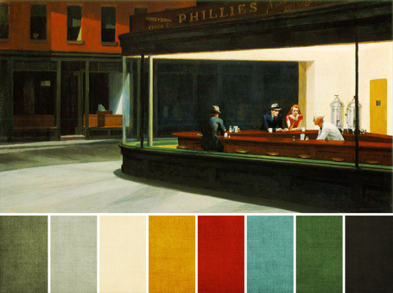
This month’s challenge piece is “Nighthawks” by Edward Hopper, and is a true masterpiece of American art. When I studied it in college, there was never a final assessment about what the meaning of it was, since it’s considered one of Hopper’s most ambiguous paintings. Several of my fellow students said it felt lonely, but I always felt like “Nighthawks” was more of a statement of sanctuary – four night owls in a restaurant in the middle of the night.
I think that initial feeling I had back then has influenced the way I view and relate to the colors in the painting; my eye is drawn first to the saturated warm colors of red, reddish browns, oranges, and yellow, colors that I personally associate with creativity. So, color-wise, my first instinct is to find the happier, warmer colors in the painting.
But the longer I looked, the more colors I saw, and I have to say that I was really surprised by all of the colors I found. Cool blues, slightly desaturated greens, and warm browns started appearing. I wouldn’t have thought it at first, but “Nighthawks” has a ton of colors in it.
So, with that in mind, and because each palette has a slightly different feel, I’m sharing all four of the color palettes I made for this month’s challenge.
What colors do you see in “Nighthawks”? Which palette do you gravitate to?


flyingbeader
June 8, 2012 at 12:17 pmThe third palette really calls to me. I don't know if it is the topaz & turquoise or the two greens with the ecru, but it really set my Muse to wondering. I think I see something in my future with this color palette.
dot
Orion Designs
June 8, 2012 at 2:48 pmThat is one of my all time favorite paintings. And I've never before seen so many colors in it. Thanks Brandi for letting me see more into this wonderful work of art!
Monique U.
June 8, 2012 at 6:43 pmAs an unrepentant lover of GREEN (must be the distant relatives from County Kerry on the Emerald Isle), I fall hard for the last palette… just gorgeous. As for the painting, my eyes immediately seek out the gentleman at the center: he is obviously lost in thought, unlike the three other figures who seem to be engaged in light conversation. I'm assuming this is intentioned by the artist? I don't have any "art training" so I've never heard of Hopper or this work. I just know I like the colour choices in the last set the best, Brandi.
Lynda
June 8, 2012 at 8:22 pmThe color palette is so helpful to me in getting started on these challenges. And having three to consider is absolutely wonderful! My eye keeps coming back to the third one, but they are all so appealing.
Thanks so much, Brandi!
V. Denise
June 11, 2012 at 5:54 pmI've never thought to use a painting for a color palette before and I must admit, I am NOT a lover of green as someone else mentioned…BUT something about this painting and these palettes speaks to me. I'll do this (even though I'm a bit terrified of the green)! Thanks for the inspiration.