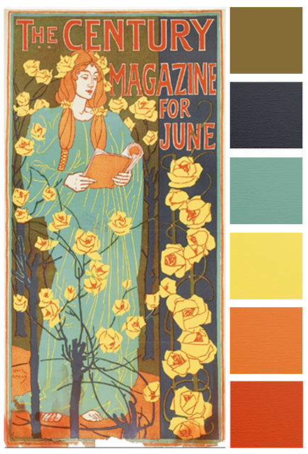
This month’s amazing inspiration is “Literary Poster for Century Magazine” by John Louis Rhead.
A vintage poster from 1896 with an Art Nouveau feel. Curve linear designs would look great with a touch of flowers.
I could see you mixing in colors and texture with leather, bent wire, copper chain, rose shaped beads or pieces of coral. I can’t wait to see your creativity with this inspirational piece.
So what is your favorite part of this month’s painting?


Katherine Thompson
June 5, 2016 at 1:04 amIalays love red but I keep looking at the shrubby part of the rose bush, how the blue black plays back and forth as a negative and positive space in the painting