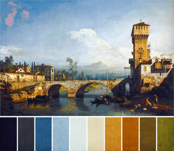
I absolutely love this month’s challenge painting, how about you? It’s so warm and inviting.
The majority of the colors in Bernardo Bellatto’s Capriccio Padovano are shades of blue and orange, with a touch of olive green here and there. This works because blue and orange are complementary colors, so they are going to play off each other and look a little brighter and bolder when placed next to each other.
The blues are going to range from dark to pale, and dull to saturated. Pretty much any blue can work here, though the darker shades (like the water and shadows in the foreground) have a touch of purple in them, and the medium shades (like the blues off in the distance) can veer a little blue-green, if you’re following along faithfully.
The oranges, too, will have a full range of values and saturations, though the bulk of the oranges and browns will fall in the mid to light range of shades. Look to the buildings here for guidelines, and choose browns, tans, and oranges that are a little more red-orange or yellow-orange than true orange.
And if you’d like an extra color to play with, choose an olive green, but use this sparingly. A lot of what we see as green in the painting isn’t exactly green, but more of a dark yellow. Because of that, you want to stay on the yellow-green side of things (versus true green or blue-green) if you do use green.
Have fun!


Ann Schroeder
May 8, 2014 at 3:03 amThank you so much for your color palettes each month. They really bring the artworks to life for me.