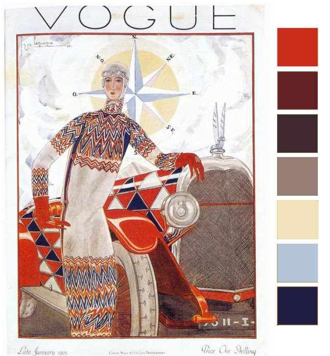
What a striking image for this month’s color palette. The reddish-orange and navy blue are taken right out of the playbook of complimentary colors from color theory. One thing that makes this color combination so successful is the strong use of neutrals to balance out the two dominating colors. You’ll also notice that the orange is the main color with the navy used less. Take that as a cue when working with complimentary colors, pick one as the main color and use the compliment as an accent.
I hope this month’s inspiration gets your heart racing and muse ready to go! Looking forward to seeing your creations.
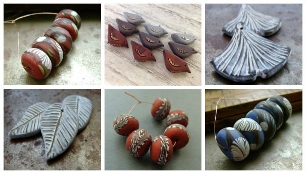
Here are some Humblebeads picks that match this month’s palette.


Dry Gulch
February 17, 2016 at 6:03 pmFabulous!