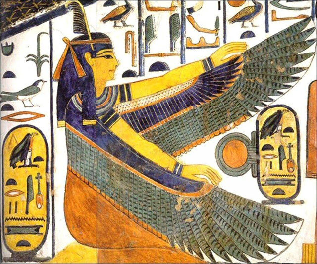
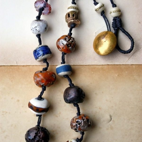
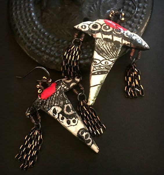
What a fun challenge for this month! The color palette is very gemstone inspired, isn’t it? Carnelian orange, lapis blue, dark turquoise and golden yellow. Here are a few color palettes to inspire your creations this month.
For the second palette, I focused on the complementary colors and omitted the golden hues. Focusing on the oranges, turquoise and blue narrows the color palette. I’d probably throw in some white to lighten up the palette too.
The third palette moves away from the brighter colors and I went for more of the muted tones in the painting. This offers a nice alternative for those of you who might not be feeling those brighter colors.
So what do you think? Are you ready to jump in and create something amazing this month?
Monthly challenge guidelines can be found here.


