My favorite color palettes are the ones with a surprise, whether it’s an eye-catching color combination or a beautiful color that pops. This month’s challenge piece offers us just that kind of surprise!
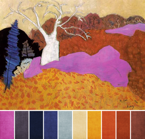
When I first saw Milton Avery’s Autumn, the vivid pink-purple in the middle of the painting caught me off guard (in the best possible way). Because the rest of the painting is very traditionally autumnal, that purple stands out, and would even if it was a slightly different shade.
Here’s why it works: blue and orange are complementary colors, and so is purple and yellow. So, even though the purple looks a little out of place at first, it works very well with the oranges, yellows, browns, creams, and tans.
Those colors offer a great background for both the purple in the middle and the blue on the left, which are more saturated and cooler. The saturated yellow-orange, fourth swatch from the right, helps match the saturation of the blue and purple, too, giving the color scheme a sense of balance.
As you start designing, I think the key is finding the right shade of purple and using it right in the middle, like the challenge painting does. If you use gemstones in your work, you might want to consider a treated stone or glass for that purple, since that shade doesn’t normally occur in nature; I’ve seen dyed chalk turquoise that could work, for example. Clay, whether it’s polymer or ceramic, or artisan glass are also great places to start looking for it, too.
Happy creating!


Lottie me
October 7, 2014 at 12:07 pmI just adore the colours you have chosen
Kristi Bowman
October 9, 2014 at 12:36 amAbsolutely gorgeous, so much vivid color. Getting ready for a big show in NY but awfully tempted to play with this palette!