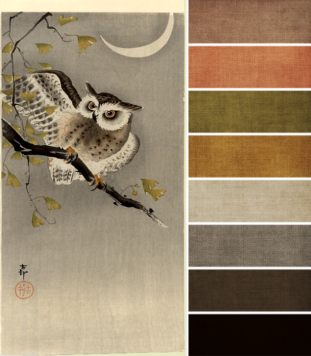
This month’s challenge painting is a study is subtle shading, and uses what I call an accented neutral color palette. The majority of the colors are going to be shades of black, white, and gray, with small touches of color elsewhere. The only true colors we have to work with this month are olive greens, dark golden yellows, a dark charcoal brown, and a muted peach.
What strikes me, though, is that you can find both warm and cool shades of gray in the challenge piece, so feel free to mix those together. If you’re following the painting closely, opt for clean, almost minimal designs, with a heavy emphasis on those neutrals – say 75% neutral, 25% color – to really bring the painting into your work.
Ordinarily, I’m a color fan, but this particular palette is just so lovely, and warm gray is my very favorite neutral to use. How about you – what’s your favorite color from this month’s challenge palette?


Sandies' Patch
October 4, 2013 at 1:00 pmoooh! love them all but, maybe the top 2 are favourites.
Surely I have something in my bead stash of these colours…….
another project in my head!
Ann Schroeder
October 5, 2013 at 4:25 pmThank you, Brandi! Your color palette posts are so helpful. You focus on colors I overlook and make the challenge richer.