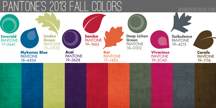
Pantone released their 2013 Fall Color picks back at the beginning of February, but I’ve been sitting on this post for a couple months now. Mostly because I really loved the Spring Colors and I wanted to enjoy them for a while. And partly because I didn’t want to think about fall yet.
But because creatives work several months in advance, and some of you might already be working on (or planning) fall pieces and shows, let’s go ahead and talk about the fall colors.
Very simply put, I love them. Love them. Take a look:
Overall, they’ve got a cooler tone to them, but a few are still nice and saturated (my favorite kind of color). Compared to Fall 2012, I like these colors better. They’re more saturated and closer to colors I personally favor, where Fall 2012 seemed a little dull to me. I’m also loving pretty much every shade, versus last fall, when I didn’t immediately react to choices like Honey Gold or Rhapsody. What do you think about this year’s picks?
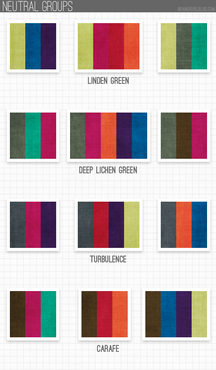
What I’m especially loving are the quasi-neutrals they included: Linden Green, Deep Lichen Green, Turbulence, and Carafe. I had a feeling those four colors will be so beautiful next to any and all of the other fall colors, so I starting playing with those first.
And I think I’m right – those neutrals/quasi-neutrals look fantastic with pretty much anything they’re paired with, which is great for color lovers like us since we can match up any other color to one of them and have it look good. Fall is usually when I start reaching for neutrals/quasi-neutrals more, so having more than one option is nice, too.
When I was playing with the swatches, I did have one surprise: I kept reaching for Vivacious a lot. I knew I’d be reaching for Samba and Koi, as those are deeper, richer versions of Poppy Red and Nectarine (which I’m a big fan of), and I love pretty much any blue, so Monaco Blue was a given. But Vivacious caught me off guard.
At first, I didn’t think I’d like it much, but the more I look at it, the more I think it’s beautiful. And it pairs really well with other colors, especially Deep Lichen Green, Turbulence, and Carafe. Those are my favorites to use with Vivacious because they really let it shine without taking anything away from it.
So while I obviously used Vivacious a lot, I also had fun pairing up the other colors, too (can you tell?). I can’t get enough of the blue-gray Turbulence, or the gray-greenish Deep Lichen Green. If I had to pick a favorite neutral, it’s a dark gray, so it’s fun to have two shades to play around with.
Your turn: what’s your favorite Fall 2013 color? Favorite pairing?


sandi m
May 28, 2013 at 5:31 pmThese are all so lush I can't begin to pick a favorite. If I had to pick a least fav it would be Koi since I'm not an orange fan. Great job, as always, Brandi!
Lynn
May 28, 2013 at 7:04 pmSpring/Summer colors are my least favorite. I have a few pink pearls & beads i bought to use with a wonderful Lynn Davis pendant but that's it as far as pastel-family components. If S/S pastels were a person, she would wear ruffles and frosted pink lipstick and dote on a fluffy lap dog. (Please pardon the stereotype.)Deep thoughts give her headaches so she stays away, content to skim the surface of life. A Goldie Hawn character basically.
To me Autumn/Dark shades have more depth, impact and mystery & the Pantone pallet speaks to me. I have some gorgeous dark grey faceted Swarovski beads that i love. Also some frosted olive faceted beads that look great with grey as well as deep Montana blue … and a bucketful of saffron, curry, deep reds and oranges like sugar maple leaves in autumn. She's someone like Angelina Jolie — her own woman, a rule breaker, fearless, not afraid to tackle the dark side of life.
Me too as far as Deep Lichen Green, Turbulence & Carafe. (Carafe? color names can be so odd/interesting :o))
What was the question? ;o)
Cindy
May 29, 2013 at 3:58 amThis is one of my first glances looking ahead until Fall. Like you, I have been avoiding talk of Fall as I have been waiting for Spring/Summer for so long (and it is my favorite time of year). These deep color combinations are really beautiful, and like the previous comment, my favorite combination is the Lichen Green, Turbulace and Carafe. I especially loved the far right side of the color chart at the beginning of this post.
TesoriTrovati
May 30, 2013 at 1:11 pmI just love the new fall colors! I am not ready to think about that either, but I thank you for the nudge, because I need to start thinking about it and a revival of my Sari Snapshot pendants and the fall Forest Finery are in the works. This will help me determine the colors. I am also happy to see these because I just bought a huge stash of polymer clay in colors. (Usually I work in white or pearl as polymer is my canvas). I would say that I have clay to represent all of these color combinations. That makes my heart happy. I am excited to see what I can produce with pc after learning some cane secrets from Heather Powers herself! Thank you for your insightful, timely and so knowledgeable posts, Miss Brandi! They are my favorites! Enjoy the day. Erin
P.S. I don't think I can choose. I love them all! I especially love that deep purple, the fuschia and the orange. And gray is unexpected. Love it!
Kristin Oppold
May 31, 2013 at 2:03 amI love Koi……mostly because I am on a bit of a Sunstone binge, its saturation of color can vary in the quality of the stone. It pairs nicely with gunmetal or copper. Looks great with that cool turbulence color. I love to play with hot and cold colors. I am kind of into that Carafe color, can't decide what shades are in it…bronze green?? Lots of fun new colors to play with for fall!