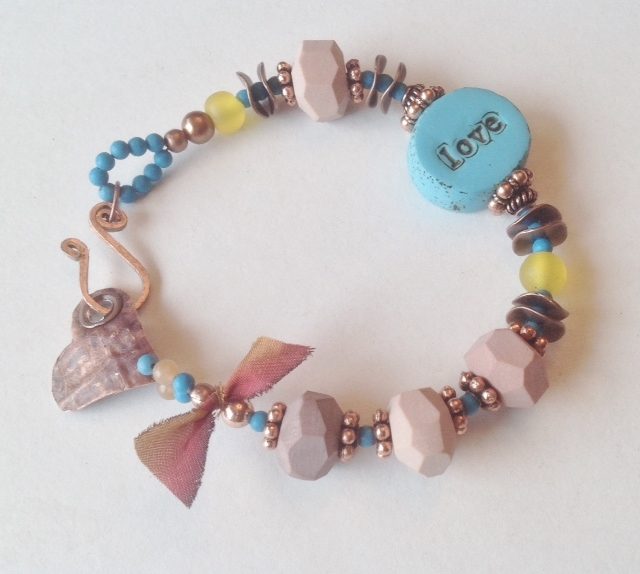
As Heather pointed out the other day in her blog post on her site, “Accidentally on Trend,” the Pantone colors for the year 2016 are Rose Quartz and Serenity. At first this baby pink and blue seemed to be so pedestrian and simple, but the more I see them the more I like them. And Miss Terri has pulled out all the stops on this bracelet that melds those two colors together in a fresh way. Terri has the right idea of balancing the brighter blue with the softer pink, bringing little touches of that blue all the way around and adding in just the right amount of soft yellow for interest. Even the copper metal and the ribbon brings a depth of rusty rose to the party. I think that for this color combo to work and not scream “baby shower” it is all about proportion. Funny that a painting that was chosen by the Art Bead Scene team so long ago is so spot on for the New Year palette!
Featured Bead Artists :: Barn Burd Designs + Swoondimples
You can find more details in this post about the exciting new changes,
including a board devoted to art beads inspired by the monthly challenge!
(Ooh! Look! More pretty beads to lust after!)
you post a link in your Pinterest description so that I have someplace
to attribute the picture!
beads – providing links to bead makers is appreciated!
Monthly Challenge Recap post for December 30th.


Kathy Lindemer
December 16, 2015 at 4:31 pmNailed the colors perfectly!
Katherine Thompson
December 17, 2015 at 3:43 pmGreat Job as usual Terri and how nice to collaborate!
Terri
December 17, 2015 at 7:30 pmI noticed the accidental Pantone colors too..how very serendipity! Especially when you think it was selected months in advance. Thanks to Katerine of barn burd designs for the metal heart I turned in to a link and for her custome making the beads for me this month and thanks to Heather of swoondimples …my winning some of her beads worked out great Pairing these two artist for this month's challenge and thank you at ABS for the huge compliment.