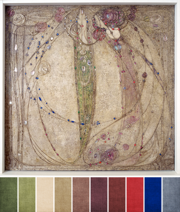
If you’ve been playing along with ABS during our monthly challenges, you’ll know that our challenge paintings have been full of subtle colors the last few months. We’re continuing that for September; in fact, September is all about muted shades.
As you can see in the above palette, I’ve pulled out every major color that’s represented in Margaret Macdonald’s “The White Rose and The Red Rose.” The color swatches are pulled directly from the painting, as always, but you’ll also notice that color amounts are going to be key to this month’s challenge. Because while you can find the sage-y greens, reds, purples, and that bright blue, the majority of the painting are shades of cream, beige, tan, and gray.
So, if you love bright colors, you can use pops of them around your challenge piece against a backdrop of those muted beiges and tans – just like the challenge painting does.
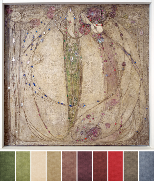
But as I was putting together that first palette, I realized that while it’s a faithful representation of the challenge painting, that bright blue was sticking out in a way that didn’t blend well (for me) with the other colors. So, I created a second palette option that swaps out just the bright, saturated blue for a softer, calmer gray. Take a look:
What I like about this palette over the first is that all of the colors have the same saturation. None are too bold and bright, none stand out in a bad way. Instead, they all flow together well and in a way that makes sense visually. From strictly a color perspective, this palette matches the feeling I get from the painting better than the first, even if it doesn’t represent all of the colors you can see in the painting.
But as always, it’s your choice as the designer! Which direction do you plan to go on this month? What palette are you loving?


Carol Briody
September 6, 2014 at 10:45 pmThank you for 2 color palettes this time around, Brandi. The first one really brought my attention to a few of the brighter colors, which my eyes 'missed' because they are in spare frequency…I'm really glad you brought them forward in the 1st palette. I do love the second palette even more!
Colleen
September 9, 2014 at 2:29 pmI like the 2nd palette best, I think. I want to bring in a pinker mauve, though. Because I love pink. 😀 I would also be tempted to bring in a bit of the two shades of blue because I see both (the muted and the bright). Just a little pop.