Welcome
to Studio Saturday! Each week one of our contributors gives you a sneak
peek into their studio, creative process or inspirations. We ask a
related question of our readers and hope you’ll leave comments! As an
incentive we offer a free prize each week to bribe you to use that keyboard. The following week we choose a random winner.
This weeks winner is…Cheryl Roe! Congratulations! You have won the May edition of a Curious Inspiration Kit from the Curious Bead Shop courtesy of Rebecca Anderson!
Please send Rebecca an email with your address and she will get it right out to you.
Welcome, welcome!
You are in the Humblebeads Studio and I’m your host and artist-in-residence, Heather Powers.
With the renewed energy of spring that brings life back into the world, I feel revitalized. My hands and mind have been working away as my creativity has sprung into action. I seem to have a new idea bloom every day!
I’ve been sharing some of my process photos with my friends on Facebook, everyone likes to see the behind the scenes of how an artist works.
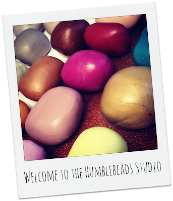
 Here you can see some custom colors that we’ve mixed up. I love starting a project with a color palette. Where do my color palette’s come from?
Sometimes they happen from us mixing up scrap clay and serendipity is the muse then. Sometimes I follow along with Brandi Hussey’s color palette from the Art Bead Scene’s monthly challenge and create colors to match her well chosen palette.
Other times a photograph or work of art will inspire the colors. My latest beads were inspired by a series of paintings and textiles that I’ve been collecting on Pinterest. Whenever a floral design on a black background would appear, I would pin it to my Midnight Garden board. This was the basis for my latest creations. Rather than picking one painting, I was inspired by hues and designs from the entire board.
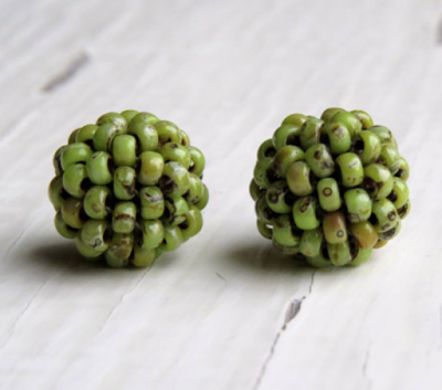
Midnight Garden Big Disk Beads
I can see myself revisiting these inspiration sources again and again for new color palettes and motifs. It’s a visual goldmine. If you know my work, which is usually soft and muted in colors – these are quite a surprise. I was ready for something bold and bright and my Pinterest board gave me just the inspiration I was craving.
So my question for you this week is kind of a homework assignment – share a link in the comments below with a color palette you have find inspirational lately. I may just borrow it for a future series of beads!
My prize is a $30 gift certificate to my all new website at Humblebeads.com. Just leave a color palette link in the comments to enter.
And to celebrate my new website I’m offering a coupon for our readers: use discount code NEWHOME for 20% off your purchase this weekend at Humblebeads.com.


Charis Designs
April 13, 2013 at 3:44 pmI'm loving jewel tones- started this board b/c of another challenge, but I look at the pins and just get dreamy all over again!
http://pinterest.com/charisdesignsj/colorful-world/
Christie/[email protected]
Urbanscapes...
April 13, 2013 at 3:45 pmHere is my favorite spring scene and palette – "Luncheon of The Boating Party", a painting by Renoir…
http://upload.wikimedia.org/wikipedia/commons/e/ea/Auguste_Renoir_-_Luncheon_of_the_Boating_Party_1880-1881.jpg
Kaushambi
Kristina
April 13, 2013 at 3:47 pmI've been loving schemes that include pink for some reason. My favorite has to be this pink and gray fabric from Hawthorne Threads.
http://www.hawthornethreads.com/fabric/designer/joel_dewberry/notting_hill_sateen/pristine_poppy_in_pink
Maneki
April 13, 2013 at 3:51 pmBeautiful colours and lines in those beads! Not my usual taste (like you I love muted colours), but I do really like the bold colours and motifs here. Very much an essence of the artwork that inspired them.
I have two favourite palettes (at least!) at the moment:
– dusky blue and matte copper or variations thereof http://pinterest.com/pin/109634572150384292/
– teal (or green-blue like aqua) and purple with or without copper (my palette of the latter: http://wildrosesandblackberries.blogspot.com/2012/11/november-bead-soup-palette.html )
Blues, including teal, never used to be my cup of tea, but lately I've been drawn towards some of those colours. Same thing with hot pink, which I usually close to hate even though I loved it as a kid. It can easily get too much, but now that I've kept away from it so long with was a fab vibrant and positive colour to work with.
Audrey Bélanger
April 13, 2013 at 3:52 pmDesign seeds makes my favorite palettes. Here's a few that I have pinned for inspiration :
http://design-seeds.com/index.php/home/entry/galactic-lights
http://design-seeds.com/index.php/home/entry/nebula-hues1
http://design-seeds.com/index.php/home/entry/emerging-flora
http://design-seeds.com/index.php/home/entry/nestled-blues
Chelester
April 13, 2013 at 4:06 pmI'm loving the blues and purples lately like this palette:
http://design-seeds.com/index.php/home/entry/color-swim3
Rising Designs
April 13, 2013 at 4:09 pmhttp://design-seeds.com/index.php/home/entry/succulent-color2
Try this awesome color palette.
jesdeamer
April 13, 2013 at 4:25 pmI was really intrigued by bee eaters for some odd reason yesterday
http://www.arkive.org/european-bee-eater/merops-apiaster/
Maryellen Siegel
April 13, 2013 at 4:30 pmI love this color palette for this time of year!
http://www.wallsave.com/wallpaper/1024×768/waterfall-nature-hd-widescreen-beach-scenes-scene-bulkupload-239529.html
Lisa Caryl
April 13, 2013 at 5:06 pmHere is one of my favorites, The Iris Garden at Giverny by Monet
Cristi Baxter Clothier
April 13, 2013 at 5:25 pmI love the colors in the painting by Willem de Kooning
http://pinterest.com/pin/110267890846767846/
Cristi
[email protected]
Melanie McGready
April 13, 2013 at 5:58 pmThis is my favourite palette of the moment. Funnily enough,it originally comes from Art Bead Scene, but I found it on Pinterest. http://pinterest.com/pin/513691901217099251/
Mel
Klassy Joolz
April 13, 2013 at 7:25 pmI fell in love with this palette…love the zebra. Maybe some animal print?
http://design-seeds.com/index.php/home/entry/striped-tones1
Kathy Lindemer
April 13, 2013 at 7:27 pmI adore your new color palette. I mentioned blog article and your color palette on my blog.
I also have a color palette on it that I created. I hope you will visit my blog at
try-creatng-color-palette.htm
to see it.
Doreen
April 13, 2013 at 8:03 pmHeather, I just love how you've pulled shapes, patterns and colors from those works of art and made them into beads! The beads are fabulous!
There are a couple of color pallets I am really liking right now which are found in artwork pinned to a couple of my pinterest boards. One is soft and the other more bold.
http://pinterest.com/pin/164874036330711506/
http://pinterest.com/pin/164874036330793584/
Rising Designs
April 13, 2013 at 9:12 pmI love this color palette!
design-seed.com/index.php/home.
entry/succulent-color2
Nancy
Pamela770
April 14, 2013 at 12:20 amThis:
https://www.etsy.com/listing/75921691/orion-nebula-8×10-inch-metallic-print?ref=usr_faveitems
A really pretty picture with lots of pretty colors
🙂
KayzKreationz
April 14, 2013 at 2:23 amI don't have my computer right now with the link for the color palette I'm thinking of. But I recently took part in a challenge by Erin Prais-Hintz with photos of the earth from a government website and they were awesome. When I get back home to my computer, I'll try to find the link to the one in particular I'm thinking of.
Lisa Caryl
April 14, 2013 at 2:40 amAh, I see my link didn't work, here it is, again. http://www.coveroid.com/view-the_iris_garden_at_giverny-1024×768.html
Liz
April 14, 2013 at 3:06 amGorgeous summer Colors!
http://design-seeds.com/index.php/home/entry/summer-party
Carol D.
April 14, 2013 at 3:19 amI found design-seeds.com. Lovely color palettes.
beadrecipes
April 14, 2013 at 11:21 amHeather, love the jewel tones on a black background you've used here. Would work just as nicely in winter as in summer too — beautiful! I spend a lot of time browsing Design Seeds palettes, I find the pictures as inspiring as the palettes created from them.
The colours in this palette from Design Seeds reminds me of the sunsets I witnessed this last couple of weeks, on a holiday at the beach. I saw one of the most stunning sunsets I think I ever saw, and this picture gets close to it.
http://design-seeds.com/index.php/home/entry/mental-vacation26
Debras Dezinez
April 14, 2013 at 5:45 pmI love blue's and found this amazing picture with every color and hue of blue I had to submit this ! Good Luck to everyone thanks for the chance to be entered !
http://pinterest.com/pin/142074563217393639/
Divya N
April 15, 2013 at 5:41 amI love both complementaries as well as multi colors for my work and this kolam is just so full of color http://pinterest.com/pin/167688786097086328/
Despina
April 16, 2013 at 1:43 pmI adore these ones right now:
http://pinterest.com/pin/282600945340129102/
http://pinterest.com/pin/282600945340129104/
http://pinterest.com/pin/282600945340129109/
http://pinterest.com/pin/282600945340129111/
http://pinterest.com/pin/282600945340129118/
My best,
DESPINA
[email protected]
Erin S
April 17, 2013 at 9:49 pmlove these.
http://www.brandigirlblog.com/2013/04/color-palette-155-more-slow-shutters.html