As a creative, I have always been drawn to color. I love the way my Crayons were always lined up with their pointy hats ready for me to turn that coloring book into a masterpiece. It was there that I started experimenting with my favorite colors and how they worked together without really knowing the science or theory behind it.
I really have absolutely no training whatsoever in art. I just know what
I like. I seem to have a knack for colors, but I have no idea why. I
wasn’t even sure that I was doing it right, or that there was even a
method to my madness. So a few years ago when I first discovered our editor Miss Brandi Hussey,
I was intrigued by her masterful use of color, first in her
Catie’s Blue jewelry and then in her amazing photography. She sucked me right into her color-filled world and I have to read her blog every chance I get. I know that color is her obsession, and I am so glad that she shares that with us. I personally find Miss Brandi fascinating, down-to-earth, and totally my go-to color guru. She has taught me so much.
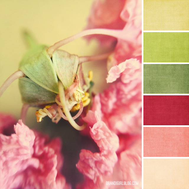 |
| {Color Palette #171: Crepe Myrtle} |
And then I found her custom made color palettes. I was hooked.
Miss Brandi doesn’t make jewelry anymore (and the pieces I have from her are some of my very favorite), but her love of color, and more importantly, her winning way with explaining it in terms that I can easily grasp, gets me excited every time. It is like I opened up that box of Crayons again for the first time excited by the relationships of all those colors just waiting to party with me!
I don’t know about you, but Miss Brandi’s color theory posts on Art Bead Scene are some of my very favorite. I look forward to them every month, especially the ones where she shares her take on the artwork that has been selected and shares multiple palettes that can inspire us. It’s not as if I don’t see those colors in the art, but to understand the relationships they have to each other really makes the art come alive for me.
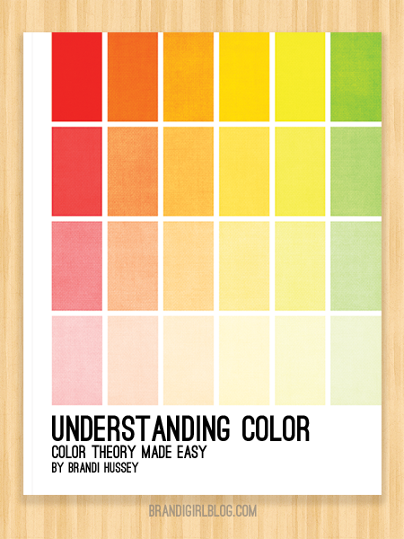
When I heard that she was compiling a book of all her color theory posts, I knew that I had to be the first to sign up! Just last month, Miss Brandi released her book Understanding Color: Color Theory Made Easy. I signed up for a pre-order and got both the instant download and a copy of the print version.
I got my print copy of the book Understanding Color this past weekend. I
LOVE IT! I also have the digital version (which I have on my computer at work so
that when things are slow I can have a bit of inspired reading), but
there is nothing quite like holding a book in your hands. This one is so
soft and silky, the colors are so vibrant and it is laid out so well. Blurb.com does a wonderful job with self-published titles and I am very impressed with this one.
Brandi’s stated goal is to “make color theory approachable.” She has done just that. Without a degree in art, I have felt stymied by some of the way that color is explained in that world, almost to the point of tuning out. But with Brandi’s new book, I know that it finally makes sense to me.
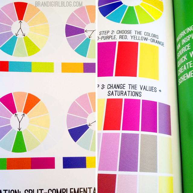
My favorite part of this book is the chapter on Color Relationships. Let’s face it: the thing that sets our designs apart, or whatever art that we are called to create, is the relationships of the colors that we have chosen to use. I didn’t know why I liked the combination of red, yellow-green and blue-green, I just knew that it worked. Now I understand that it is a Split-Complementary color relationship.
I also like that she goes into depth on Value & Saturation, especially focusing on the role that black, white and the quasi-neutrals like brown and beige play in design. I am fond of saying that black is my favorite color. Now, I know that it is not a color in the true sense of the word, but it is to me. And now I know why. These supporting cast members can really play a pivotal role in a design, or as Brandi puts it, “They add a lot of depth to a song without taking away from the lead singer.” I love to sing, so I love that analogy! Descriptions like this are what makes this book very accessible for those not steeped in the science of color.
From how a color is made, to how you see a color, to how you use a color, Miss Brandi’s step-by-step workbook really stands out to me as a go-to reference for creatives of any type. So if you are ready to take your art to the next level – it doesn’t matter if your chosen medium is jewelry, paintings, interior design or fashion – this book should be on your shelf!
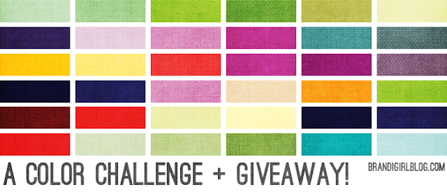
Your challenge, should you choose to accept it, is this: grab a color palette, make a piece of art using those colors as
inspiration, then enter to win a prize pack.
Once you’ve made your piece, take a photo of it, then fill out this form to submit your entry. Don’t delay! You have until 12pm Central Standard Time on
Wednesday, July 10th, 2013 to enter. Join me, won’t you?

