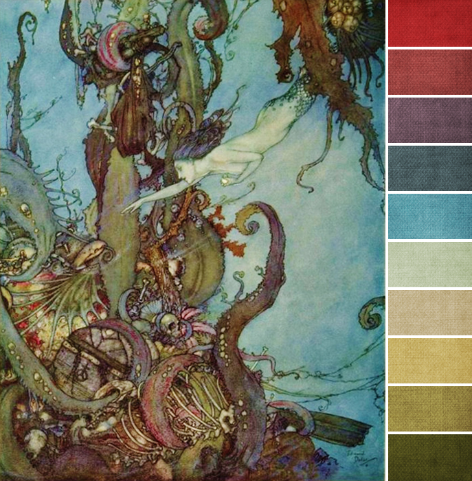
Whenever summer rolls around, I just want to be at the beach. That’s how I spent my summers growing up (total water baby over here), so this month’s challenge art work is right up my alley!
So, too, are the colors. Pretty much every color is represented in some form here, with the biggest amounts being shades of blue and green (my favorite), and the next being the purples.
The trick with this painting is to make sure not to go too bright or saturated here. Overall, this is a fairly muted painting and color palette, with dozens of subtle shades that blend into each other, versus boldly standing out. Keep everything toned down and cool – like choosing cooler yellow browns instead of warmer orange browns, and blue-purples over red-purples – and you’ll be just fine.
You also want to watch the amount of colors you use. The red at the top, which is the brightest, most saturated of all the colors, is only used sparingly in small amounts; same goes for the yellow-y tan. But you can use as much blue, green, and purple as you like. Start with light to medium blues, medium to dark olive greens, and dark blue-purples, and go from there.
Your turn: what colors are you loving from this month’s palette?

