Happy 2015 everyone! How’s it going so far? There’s not really been enough time to catch our breathe so far, but I hope you’re feeling positive about the new year. It’s just numbers after all, but I think everyone takes this opportunity to take a look around, dust ourselves off and work out what can be tweaked and enhanced for the new year. I think that when you’re in the arts also, the year’s end has a natural feeling of conclusion more than perhaps in other areas – a sense of some sort of line being drawn beneath the oodles of craft fairs and art markets, the end-of-year sample sales and suchlike. What next, I certainly find myself asking?
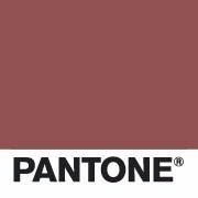
Well, one thing that is set already for 2015 is Pantone’s Colour of the Year. Announced a couple of months ago by the Wall Street Journal no less, this year’s colour is probably one you’ve already seen bobbing around on the inter-web, but just in case you’ve missed it, here it is:
What do you think?
It seems very dull here, perhaps a colour that could be used within a colour palette, but not strong enough (for me) to be a contender for colour of the year.
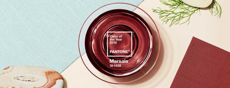
But the more intense version, as shown in the first picture and also here:
is much more my cup of tea – or should I say,
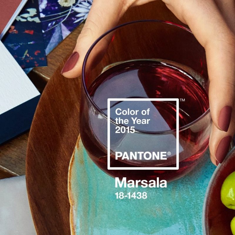
Marsala! I particularly love it above, paired with that vivid duck-egg turquoise. I can see this being a much-visited palette throughout the year.
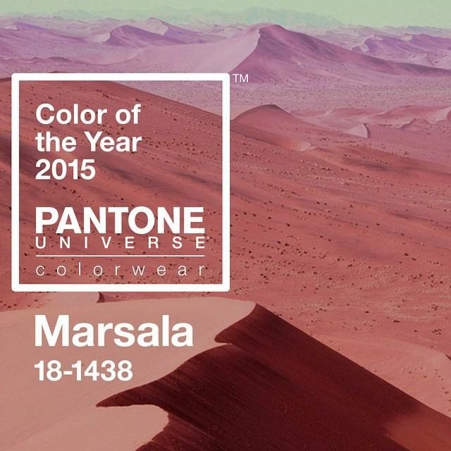
I also love it here, in this more monochromatic photograph – just a little cool blue off-white at the top there.
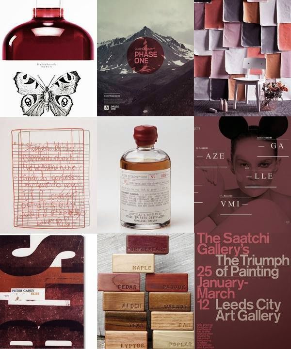
Pantone have also made this little collage, which they say this of:
“A rich contrasting color, Marsala is ideal for use in graphic design and packaging. Eye-catching, but not overwhelming or bright, consumers are immediately drawn to the hue, making it an alluring shade at point-of-purchase.”
What do you think about Marsala? If you’re on the fence, I suggest checking out Heather Powers’ board of
‘Wine Color Palettes’ over on Pinterest for some major inspiration.
There you go, a little introduction to the colour of the year, according to Pantone. Is it a colour you’ll be using? Are you drawn to it? Or does it make you switch off? (I must admit to having felt like that about
Radiant Orchid, 2014’s colour of the year).
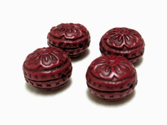
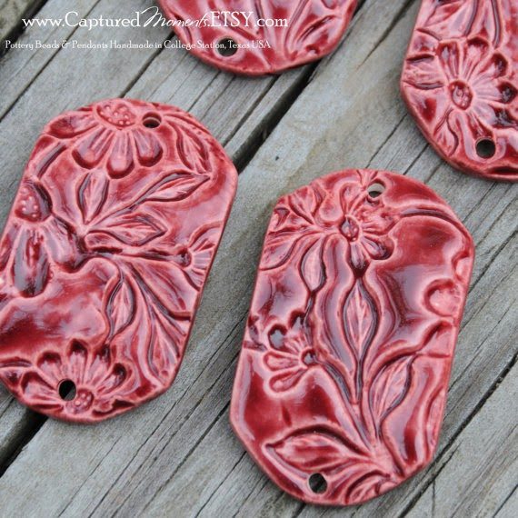
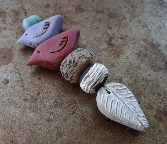
And you’ve guessed it, this month’s Muse posts are going to be all about Marsala, or red wine-toned beads. I’m excited to explore this new colour for a new year – how about you?
Here are just a few to get us started:
Don’t forget to share your own marsala bead links in the comments below – I’d love to see what you’ve found.
And now for the BeadBlogger Links. Have a great week!

