Backgrounds!! That was sudden wasn’t it? But yes here we are, the long awaited backgrounds post, the purpose of which is to teach you the best way to present your product, whether it’s handmade, vintage or supplies.You might not think it’s that big a deal, but trust me- it’s crucial!
The purpose of the background is not only to showcase your item but also to give you shop an overall ‘vibe’- or what the marketing chaps call ‘brand concept’. Light ones will make your shop look bright and airy, dark ones will give you drama, patterns will give you an opulence either way and colour will give you vibrancy.
In order to pick the best background for your product, you have to first do what I’m always telling you to do – know your market! Figure out who’s most likely to buy your goods and market them accordingly. This of course may change over time, but as an example, in all the styles I’ve gone through there’s a strong theme of romance, because I make romantic jewelry. Even if your jewelry doesn’t look particularly ‘of a style’, you can still make it so- from coloured enamel beads to one of a kind vintage assemblage. Here’s a pair of earrings I made in as modern a way as I can manage:
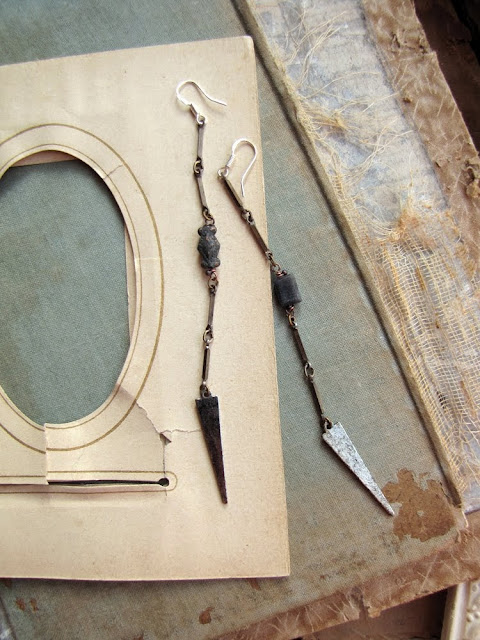
These are what Kim and I call ‘hipster bait’ -they’re a pretty straight forward design, popular with many fashionable alternatives right now. Not much that’s romantic about them, in fact they look a little bit cold (I think) with all their straight lines and silver white. But they look especially cold when shot in this style of most hipster shops- plain white background. Now then- if I shoot them on something romantic like old paper, they suddenly change:
A warmth comes into them. The earrings haven’t changed, but there’s a noticeably more attractive quality about them. Watch what happens the more romantic layering I use…
By the time we get to that last image, these earrings might as well be in the arms of Mr.Darcy for all their romantic saturation. With this deep layering of fluff and ruffles, I can shoot almost anything and it’ll look romantic.
So now you see that it’s very important your background matches your desired style because it will affect your product and your overall shop style. it will effectively dictate the style of your shop possibly more than your work will.
OK, let’s talk pale backgrounds. A couple of you commented that you shoot your product on plain white backgrounds and it’s become boring- not surprising! Though Etsy’s front page seems to favour the bright white background, it can become tired. But you can use a pale background and still have your shop look lovely and non-boring, and the key to this is texture.
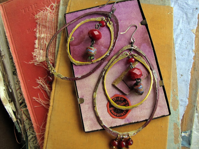
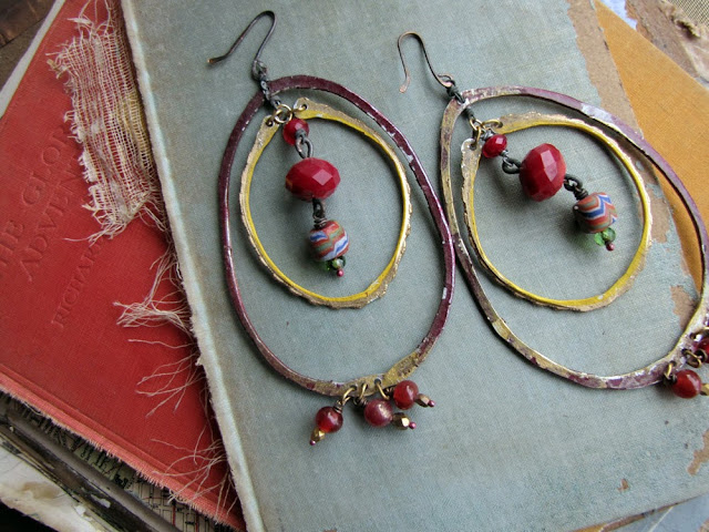
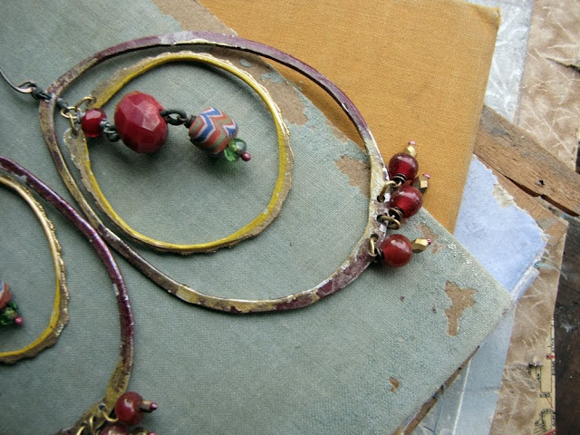
Let’s talk briefly about colour on colour- that is a coloured item on coloured background. You need to pay a bit more attention here, because the colours you use will have an impact on the item.
Above you can see the earrings are now showcased well- they’re on a pale (contrasting) background which makes their dark colours stand out, and the yellow and red either side echo the colours in the beads.
Above, the camera is angled so the red board isn’t seen, and the yellow is bringing the gold tones forward.
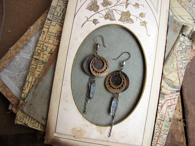
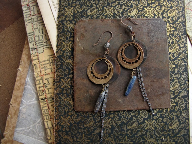
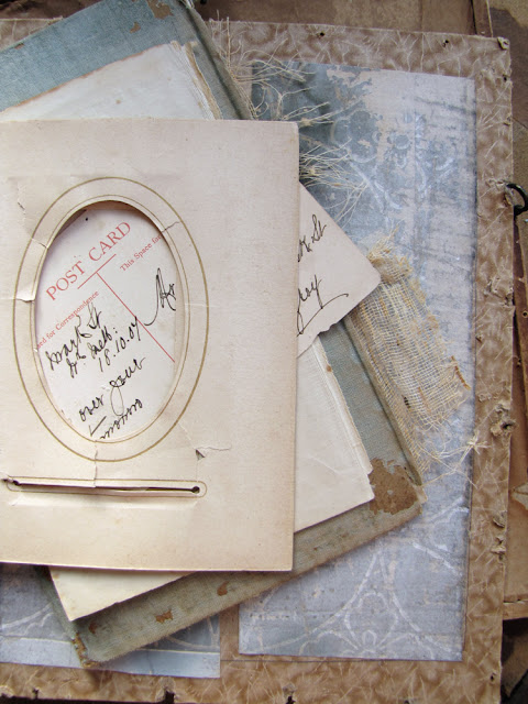
Using 3 -5 different backgrounds will ‘break up’ the monotony of your shop front and keep things interesting. You can see in my shop that I have largely the same backdrop, but I’ve changed around the stack and made some pages more dominant in some shots. This makes things cohesive and interesting at the same time.
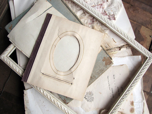
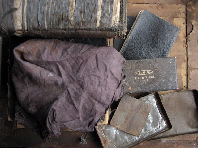
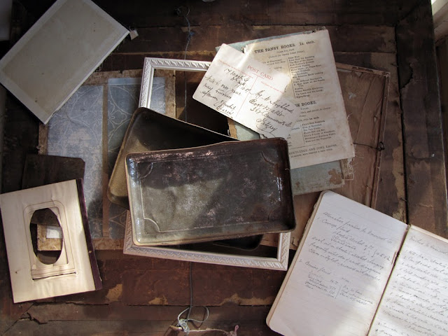
So- in the next couple of days I want you to wander around your house/studio and find a bunch of things you might like to use for backgrounds. Keep in mind your target market and shop’s brand image; choose light, dark, and patterned things. (And colour too if you’re this way inclined.) Don’t just look at book pages, think about trays, picture frame backs, the tops of old boxes, textile pieces, linoleum offcuts, wallpaper, etc. Spend time arranging them against each other (remember the bridal theory) and take some photos- things look different in camera so don’t trust your observing eye to see all.
When you’ve found the backgrounds you like, take an item of yours and try shooting it against them. If you have a blog it would be really great to blog it- it helps pass the knowledge along, and don’t forget to give me a link so I can come along and give you any extra advice you might need. If you don’t have a blog or you’d prefer a more private approach, feel free to email me from this blog’s address (see my profile) and I’ll help out.
Read (or re-read!) the original post for more tips on using light and dark colored backgrounds along with Penny’s tips for creating opulent textures and working with patterns.






+(1).jpg)