This post was inspired by a comment left on my blog a few months ago. In it, the reader said that as a jewelry designer, she sometimes struggles with matching metals to the color palettes she works up. Some work, some don’t, and she wanted another way to think about using metals when designing.
My advice is to start thinking of metal as a color.
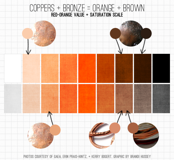
This is tricky, because you might be tempted to think of metals in terms of metallic colors. Fight the urge! Instead, go basic and try to look past the sheen. If I reference a couple color theory tools – value and saturation scales, to be specific – I can then match up the general tones of the metals I’m using with familiar colors.
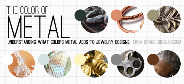
For example, copper becomes a shade of rosy orange, while bronze and Vintaj natural brass a medium to dark brown.
Bright golds and brass becomes a bright yellow or yellow-orange, while darker shades of those become brown or even green.
Bright silver and nickel can read as either white or a light gray, both of which are neutral colors. Gunmetal and oxidized silver becomes a dark gray, another neutral.
The neutrals – white, black, and grays – aren’t “colors” because they don’t have a hue. Using silver, nickel, or gunmetal in a jewelry design can help lighten or ground a piece, but won’t add or conflict with whatever color palette you’ve put together because they don’t have any color properties. If I had to classify these metals as warm or cool, they’d generally be on the cool side of things (Did you know metals can be warm or cool, too, just like beads? It’s true).
Gold, brass, copper, and bronze, though, all match to a shade or hue you can find on the color wheel, usually a shade of orange or yellow (which would place these metals on the warm side of the color spectrum). Because of this, using one of these metals in a design will add a new color to the mix, which may or may not work with the other colors you’ve chosen. If you’ve ever tried to work with gold or copper before and couldn’t get the design to look the way you wanted it to, this could be why. There’s another color at work here that you may not have accounted for.
So, if you’re starting a design with a particular set of beads you want to work with, the metal findings you choose can be part of the overall color scheme and blend in, or contrast against the beads to make everything pop. How much contrast do you want between the metals and the beads?
Let’s say I want to use a set of light pink beads, like rose quartz. If I use bright silver, the beads and the metal will blend together, since one is light pink and the other is light gray. There will be very little contrast here because of the value of the pink and the gray are similar.
If I use gold, there will be more contrast, because the bright yellow of gold has a different saturation and value than the pale pink. If I go with Vintaj natural brass, gunmetal, oxidized silver, or bronze, the pink will really pop and become more obvious, because the metal is so much darker. See what’s happening here?
That’s part of why some finished jewelry pieces pop where others don’t – there’s a dialog going on between the color of the beads and the metal. And if I want to take it even further, I can look at where that metal color fits into a color relationship with the other design colors. Does it fit well or is competing with a harmonious scheme?
Generally speaking, if you want minimal contrast in a design, use light beads with lighter toned metals, dark beads with darker metals, or beads and metals that are the same general hue (like yellow beads with gold metal). If you want more contrast, use opposites – dark beads with light metals, and vice versa.
Ultimately, though, I don’t think there’s really, truly any right or wrong decision here about the choice of metals you use. For me, that’s part of a design choice; choose what will get your vision across. But if you’re struggling with pairing metals with specific beads, ask yourself a few questions: What color is the metals I’m thinking of? Does it work with the color palette I have? What kind of contrast do I want?
If it feels like a lot to think about, just know that the more you do it, the more instinctual it will be. Chances are, you already know what you like or don’t, as far as colors go. So, if you’re struggling with certain metals, take a minute to figure out what colors those metals translate to – are they colors you like or not?
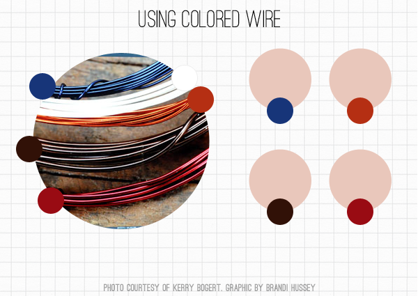
And since we’re talking about metal colors, what about patinas or colored wire? If they feel tricky or intimidating to you, use the same approach we’ve talked about here. What general color is the patina or wire? How does it work with the beads you’ve chosen? Break it down to simple colors and analyze how it works with your overall piece.
It’s not necessary to match up your metals to swatches on a value or saturation scale every single time you design. So long as you have a general idea of what the color is of the metal you’re working with, the effects of it in a color scheme, and a little bit of understanding about color theory, you’ll be able to make intentional design choices. And you can apply this to any finding or component, really, like string or cords.
So, if you’ve been struggling with using different colored metals in your work, I hope that this post helps give you a new way to look at the metals you use. If you have any specific questions, feel free to leave a comment and I’ll do my best to answer them!
And if you’re looking for more color theory, I’ve got a three part introduction on my blog, if you’d like to dig deeper, with more to come: Part 1: The Color Wheel + Color Relationships, Part 2: Value + Saturation, and Part 3: Color Interactions.
Happy creating!
Many thanks goes to the following ABS contributors for lending me use of their photos for this post! Heather Powers, Gaea Cannaday, Erin Prais-Hintz, and Kerry Bogert.


Orion Designs
January 23, 2013 at 4:48 pmYet another great color post Brandi! While using metals seems intuitive, it's so nice to see some reasoning behind the decisions I've been making over the years. And now it's obvious why some simply do not work at all.
TesoriTrovati
January 23, 2013 at 5:04 pmHow awesome this post is! I know that I will come back to it frequently. You have succinctly encapsulated the issues that we face with metal tones and it really makes sense! I prefer to mix metals in a piece and have always consider them a palette color, or like a canvas to 'paint' my beads on! Thanks for sharing such informative articles, Miss Brandi! Enjoy the day. Erin
Gardanne
January 23, 2013 at 7:48 pmExcellent information, thanks for a wonderful post.
freshbakeddesigns
January 23, 2013 at 9:12 pmAgreed! This post is so helpful. Thank you for collaborating to put it together.
Cynthia@Ornamental Style
January 23, 2013 at 10:31 pmI usually use silver (a cool color) with other cool colors and gold (or brass or bronze) with warm colors. Some colors can be either warm or cool (olive vs. emerald) so I would pick a metal color depending on the hue (is that the right word?) of the beads. And I love pinks and purples with copper. But then again, anything goes!
Jo
January 24, 2013 at 1:16 pmWow Brandi! What a fantastic post! You really do have a wonderful sense of colour, and this is a great resource to bookmark for reference for years to come.
Stacie
January 24, 2013 at 1:46 pmYep…I'll be bookmarking this post…very helpful and succinctly written…thank you!
Beaditi
January 24, 2013 at 2:03 pmFantastic post Brandi – this will be an excellent source for me henceforth!
And I will also look up your blogs on color theory 🙂
Kaushambi
Cynthia
January 24, 2013 at 2:48 pmGreat post Brandi! I have not thought about metal in this way. I almost exclusively use Vintaj Natural Brass in my designs, and your post really helps me understand WHY I love dark brass/ bronze. I love how beads stand out (or pop) against the warm, dark metal. Every bead look richer, in my opinion, when paired with bronze.
Loved your 3 part color series too – very valuable info!
sandi m
January 24, 2013 at 5:19 pmGreat post Brandi! You have a wonderful way of taking technical information and describing it in simple terms. Thank you.
Metal is always a color to me when working with beads and stones. It makes all the difference when combining the elements.
Michelle
January 24, 2013 at 8:01 pmWhat an interesting and informative post .. I'm looking at my metals differently today than yesterday as a result. Thank you!
Ann Schroeder
January 25, 2013 at 12:17 amThank you so much for this informative post. As others said, I know I will come back to it often!
Cindy
January 25, 2013 at 5:06 amGreat post, Brandi….from someone who loves working all sorts of wire, I'm always making color decisions for use with metal. Thank you for creating this resource for us – I'm pinning it now! 🙂
Jeanne aka Gem Chick
January 27, 2013 at 11:33 amThanks so much for this timely post! I've been trying to decide on vintaj brass or yellow gold filled for a design I'm working on.
glamoureffekt
November 3, 2014 at 3:40 pmnice one.. thank you for that!